Blijf Buitenspelen
Branding
The assignment is a project for “Blijf Buitenspelen,” which involved developing a brand identity, including a logo, color scheme, and letterhead.
The client is starting as a freelancer and values visual communication. Their business, “Blijf Buitenspelen,” focuses on fostering curiosity about different perspectives and encouraging connections. The aim is to view work as a playground, promoting joy, experimentation, and solution-oriented thinking through active methods, broadening perspectives, and harnessing the collective intelligence of teams.
Deliverables included designing a logo, establishing a cohesive brand identity and creating professional letterhead.
Proces
Core Values
Curiosity drives the desire to explore new perspectives and ideas. It encourages continuous learning and growth, allowing individuals and teams to discover innovative solutions. By staying curious, we keep our minds open to the possibilities that lie beyond the conventional paths.
Interaction fosters meaningful connections and collaboration among individuals. Through active engagement and communication, we can share knowledge, challenge assumptions, and build stronger relationships. This value emphasizes the importance of teamwork and the collective intelligence that emerges from diverse viewpoints.
Movement signifies progress and the willingness to embrace change. It involves taking action, experimenting with new approaches, and adapting to evolving circumstances. This value highlights the importance of being dynamic and proactive in pursuing goals and overcoming obstacles.
Utilization focuses on making the most of available resources and potential. It encourages leveraging the strengths and capabilities of individuals and teams to achieve optimal outcomes. By effectively utilizing our skills, knowledge, and tools, we can maximize our impact and drive success.
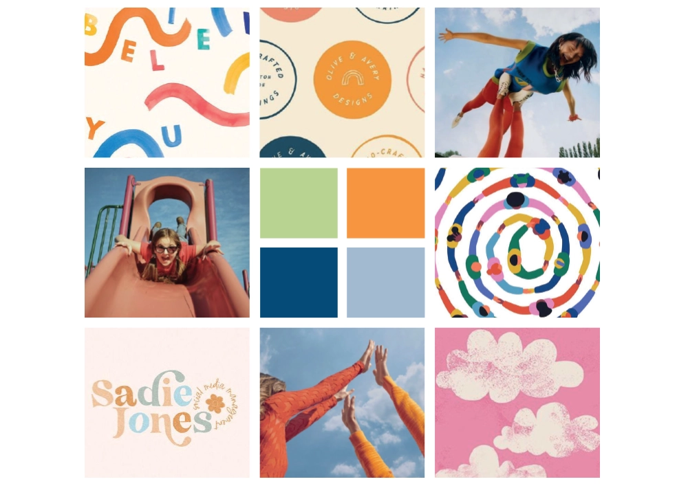
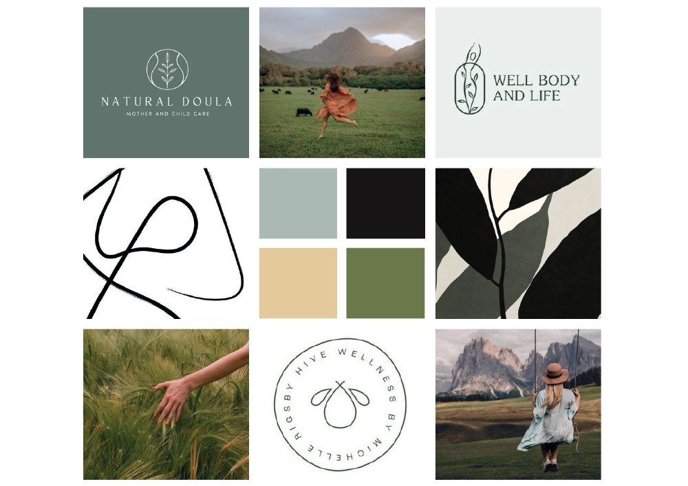
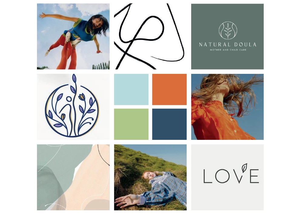
Proces Deliverables
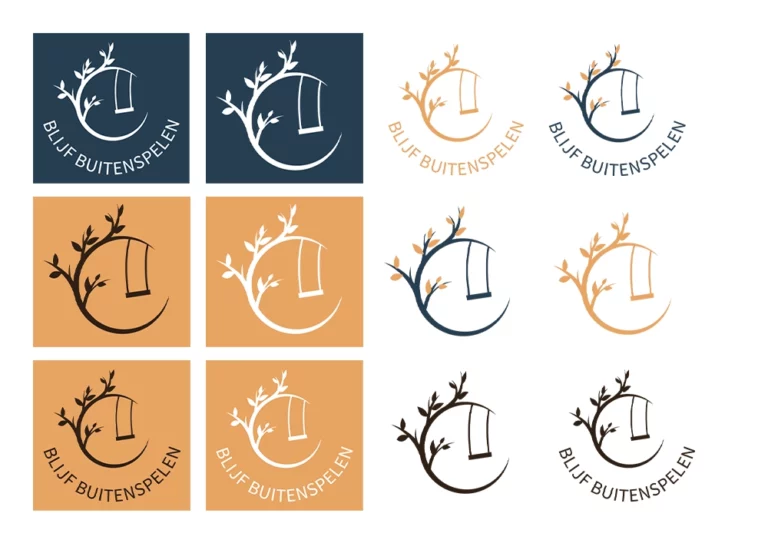
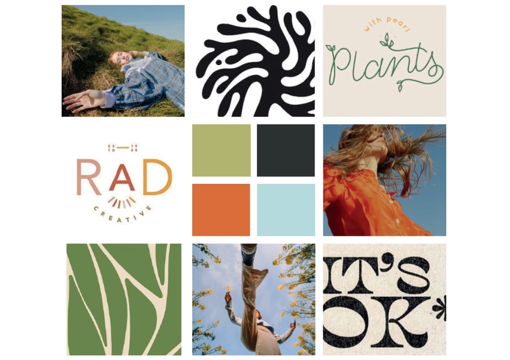
The logo features a tree with leaves and a swinging swing. We started by discussing the client’s vision. Next, we created mood boards and sketches. Finally, we made adjustments in consultation with the client.
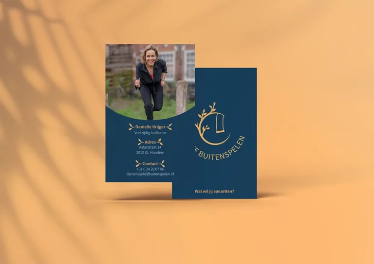
We were given a lot of creative freedom by the client. She wanted to incorporate the leaves from the logo into the business card design, but otherwise, we decided to keep it sleek and professional.
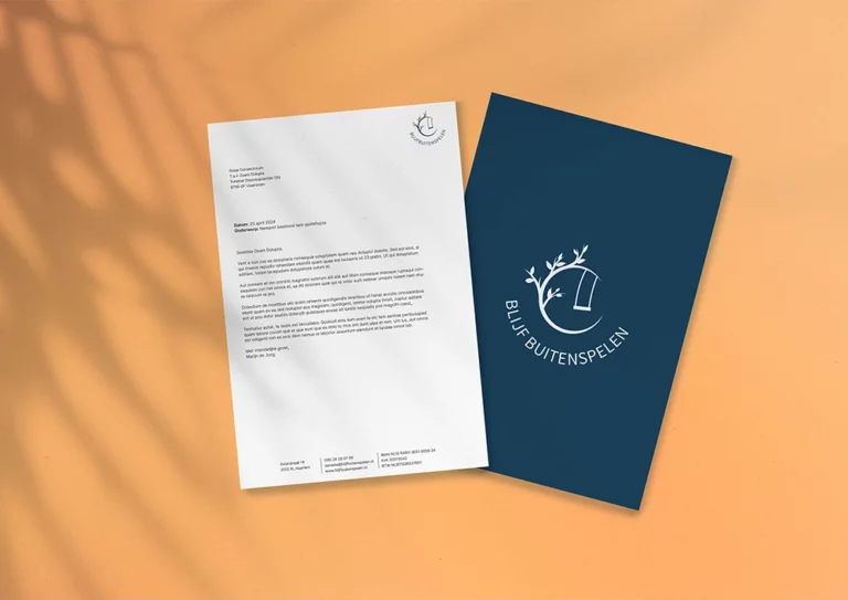
For the letterhead, we used dimensions suitable for sending in a C5 window envelope. Initially, we designed it in InDesign and discussed how the client could use it. Then, we recreated the design in a Word document to ensure it is user-friendly.
We divided the work among ourselves. Everyone contributed to the research. Once the client chose a logo, one person continued with the logo adjustments. Another person worked on the business card, while I focused on the letterhead. Initially, I also intended to work on the website, but the client wasn’t ready for that stage of her business yet. Ultimately, I compiled everything into the process book. This way, everyone contributed to and learned from this project.

