

Le Sorelle
Le Sorelle is a comprehensive brand identity designed for an artisanal gelato company founded by sisters Sofia and Stella. The project showcases the fusion of Italian gelato-making tradition with contemporary innovation, reflecting the founders’ passion for handcrafted ice cream and their influences from Japanese culture. The brand caters to discerning, adventurous adults seeking culinary excellence and unique flavor experiences.
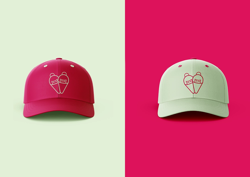
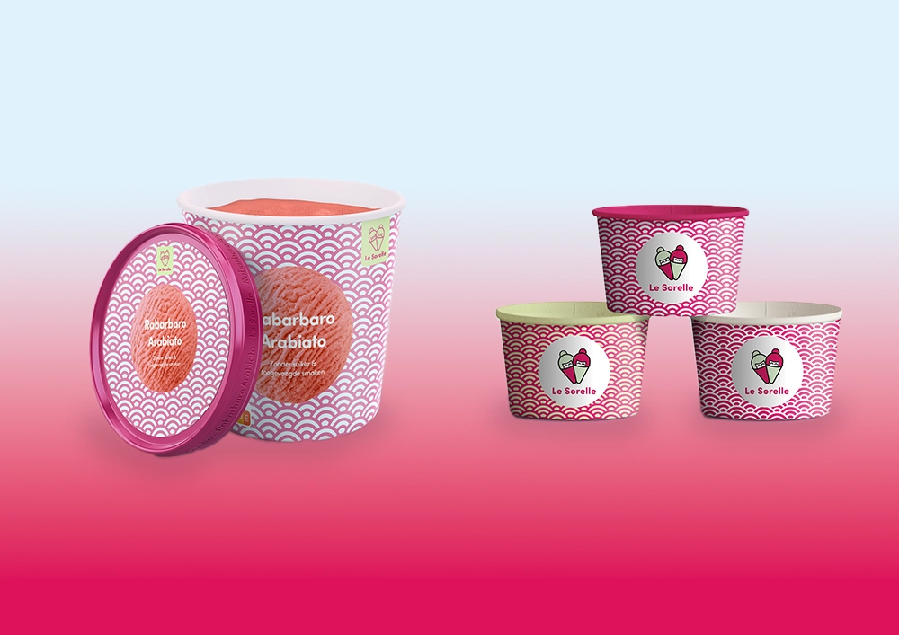
The visual identity centers on a distinctive logo featuring the sisters reimagined as Japanese-inspired characters with ice cream elements, balancing their Italian heritage with modern aesthetics. The design incorporates the Seigaiha pattern and subtle references to Japanese art and symbolism, creating a fresh, vibrant brand language. Careful attention to posture, expression, and clothing brings out Sofia and Stella’s individual personalities while maintaining cohesion across all touchpoints.
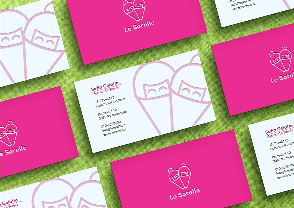
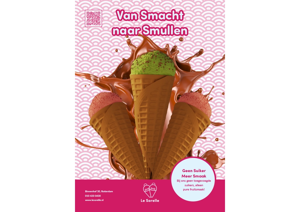
Deliverables include business cards showcasing the logo prominently, a cheerful poster with Japanese-influenced backgrounds and meticulously crafted Blender 3D ice cream illustrations, and a website featuring an engaging hero section with animated flavor renderings. The project extends to 3D mockups of branded uniforms, demonstrating practical applications of the identity. The complete brand system communicates Le Sorelle’s commitment to preserving authentic gelato traditions while challenging conventions through innovative digital ordering experiences and boundary-pushing flavor combinations.
SKP van Os, 2023
Disciplines: Branding, UI/UX Design, 3D Design, Illustration


