

K-lixer
K-Lixer Kombucha was developed as a brand introduction for Unilever, targeting young adults aged 18 to 35 who prioritize vitality and living life to the fullest. The brand offers organic, non-pasteurized kombucha in unique flavors, packaged in recyclable carton containers that reference milk pack aesthetics. K-Lixer’s core values center on authenticity, vitality, freedom, and innovation.
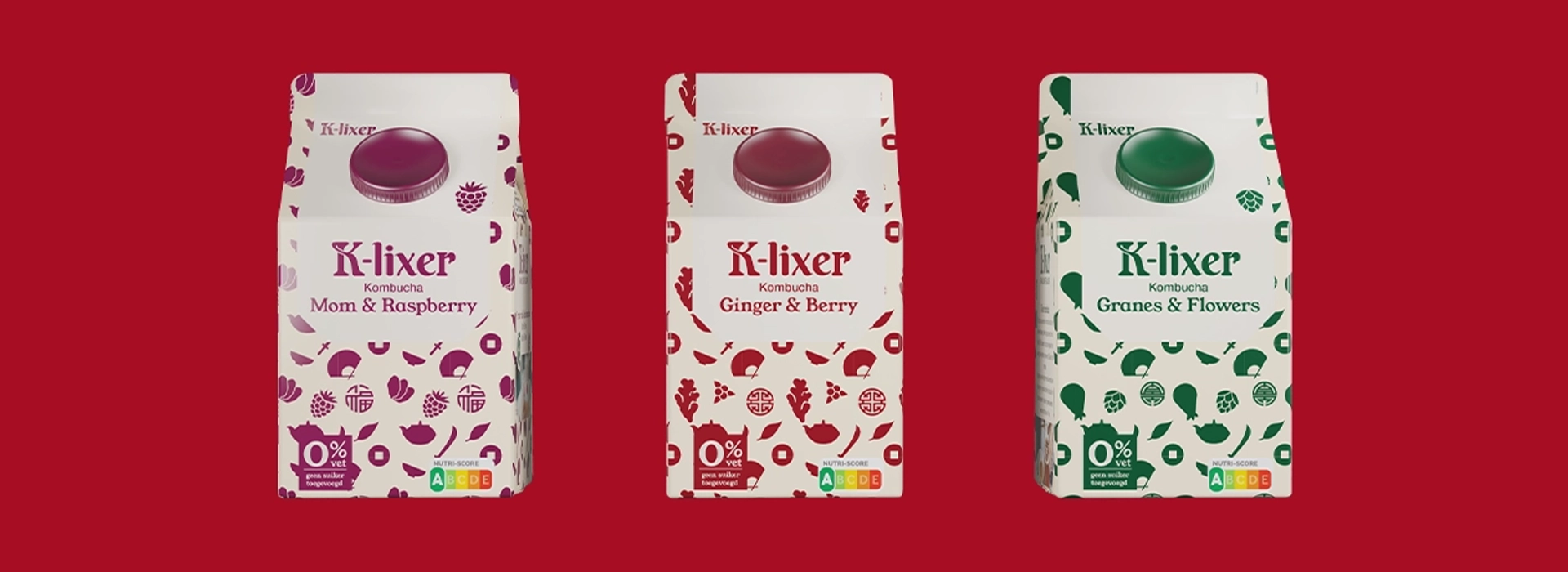
The branding features a distinctive logo that seamlessly blends two typefaces, capturing the brand’s dual nature of health and enjoyment. Custom illustrations encapsulate each kombucha flavor variant in captivating patterns, with carefully selected color palettes reflecting individual taste profiles. The packaging was developed through a methodical process—creating unique patterns for each flavor, analyzing optimal text distribution, and bringing designs to life using Blender 3D software.
The visual identity extends across multiple touchpoints: three packaging designs showcasing the flavor range, a clean and minimalist advertorial highlighting recipes with corresponding photography, and a WordPress website introducing the brand to its audience. The complete brand system communicates K-Lixer’s commitment to authenticity, health, and a hip, open-minded lifestyle—offering a refreshing beverage option that reflects innovation, creativity, and the freedom to enjoy life’s swinging moments.
SKP van Os, 2022
Disciplines: Branding, Packaging Design, Web Design, Illustration
