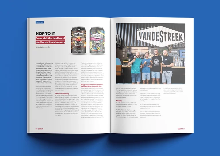
Guilty Magazine is a lively and inspiring publication by DPG Media for the Dutch government, celebrating summer’s guilty pleasures. This one-off glossy, with a 9 million copy print run, features engaging articles on entertainment, food tastings, fun sports, recipes, guilty pleasure lists, encouraging readers to indulge without guilt.
As a freelance art director/designer for DPG Media, you will create and execute a perfect design for the Guilty magazine.
I have invested a lot of time into creating this magazine. I wanted to produce something I could truly be proud of. Through these pages, I reveal a part of myself and showcase my interests. This project is a reflection of my dedication, creativity, and the things I am passionate about.
From selecting the themes to designing each page, every step was a labor of love. I hope you enjoy exploring it as much as I enjoyed making it.
First, I conducted research on other magazines such as “Psychologie Magazine” to understand their use of visuals and overall design. I analyzed how magazines integrate images with text to create a cohesive and engaging layout. This research provided valuable insights into the effective use of visuals and helped me understand how different elements can work together harmoniously in a magazine.
I also conducted a typography study. First, I researched which fonts would be suitable for this magazine, considering both style and readability. After selecting a few potential fonts, I experimented with different sizes and line spacing to determine the best combination. This process ensured that the text would be visually appealing and easy to read, contributing to the overall aesthetic and usability of the magazine.
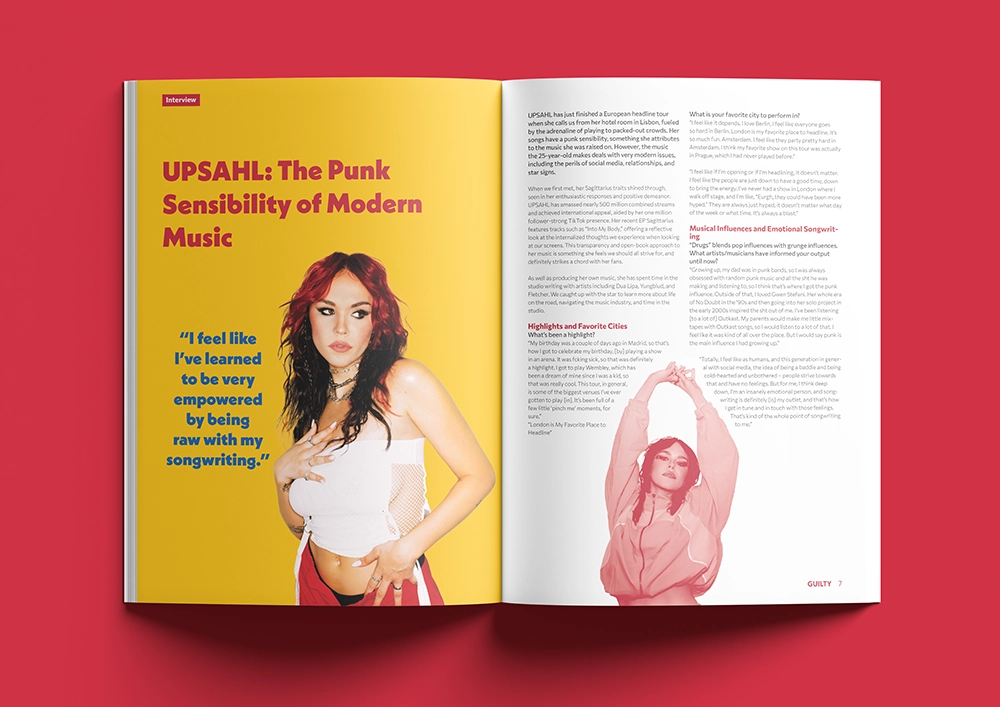
Next, I conducted extensive testing with the first article on Upsahl. During this process, I experimented with various amounts of white space, column layouts, and image sizes to determine the most effective design. This experimentation helped me understand how these elements impact readability and visual appeal. Once I refined the layout and design choices for the Upsahl article, I applied these principles to the other articles in the magazine. This ensured a consistent and polished look throughout.
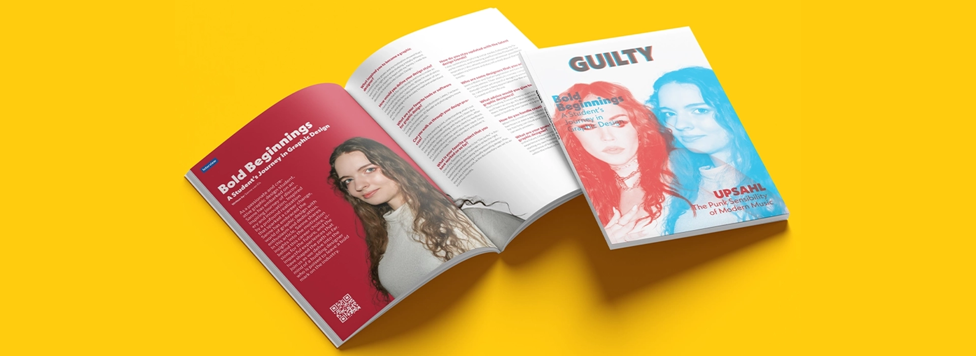
For the cover, I drew inspiration from Carnovsky’s work. Instead of using three colors, I opted for two colors that worked best: red and blue. With a blue filter, the red elements become more prominent, and with a red filter, the blue elements stand out. This choice not only added a dynamic visual effect but also created an intriguing and interactive experience for the reader. By carefully selecting and testing these colors, I was able to achieve a striking and unique cover design that sets the tone for the rest of the magazine.
I took the photos myself at the Museum of Myself and the Van Gogh Museum. At the Museum of Myself, I used a photo box to capture the images, ensuring they were well-lit and clear. I then carefully edited each photo in Photoshop, making them freestanding and enhancing their overall quality.
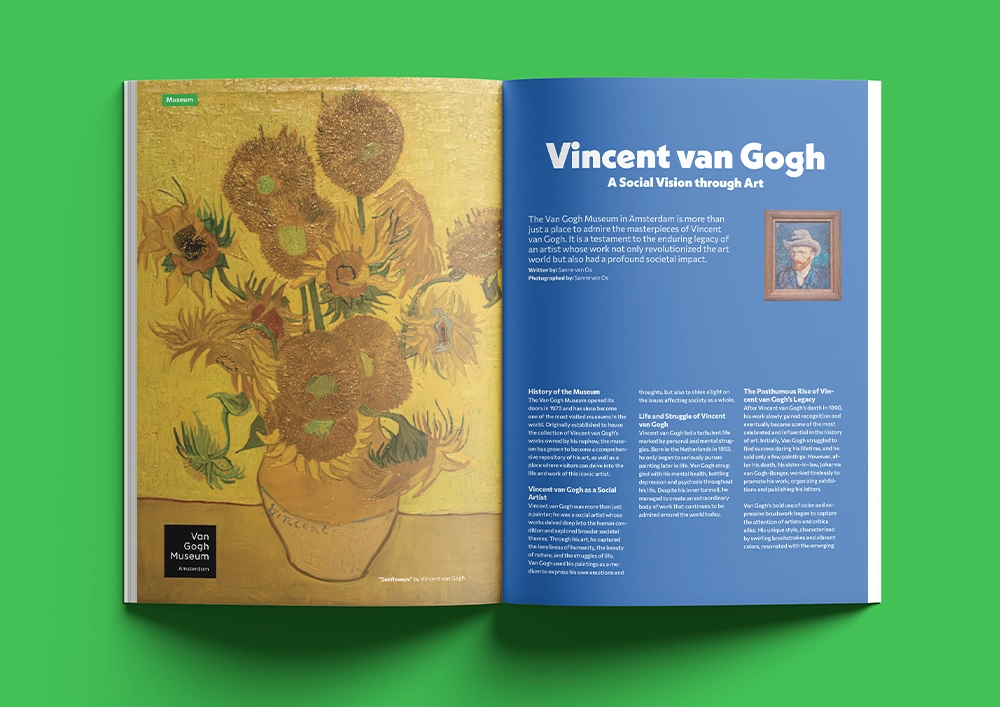
For the Van Gogh Museum, I photographed each painting individually. I meticulously edited these images in Photoshop as well, making them freestanding and adjusting the colors and details to best represent the original artwork. This process allowed me to create high-quality, polished images that seamlessly fit into the magazine’s layout.
I paid particular attention to the use of colors and how they guide the reader’s experience. I organized the content into distinct sections to create a logical and engaging flow. First, I focused on art, followed by a section about myself, then drinks and food, next gaming, and finally, DIY projects and puzzles.
Each section was carefully curated to ensure a seamless reading experience, with colors and layouts chosen to complement the content and maintain the reader’s interest. I hope you can see my thought process and the dedication I put into every aspect of this magazine.