Djourney
Oxy Junky is a documentary film poster designed to capture the twelve-year journey of Esmee, a woman overcoming her addiction to oxycodone painkillers. The poster needed to convey the gravity of addiction while honoring the documentary’s ultimately hopeful conclusion, told from Esmee’s personal perspective.
The design employs a bold, block-letter typeface for maximum readability and professional impact, deliberately avoiding horror-inspired aesthetics. Drawing inspiration from the “Dopesick” poster’s symbolic use of typography, the design integrates painkiller imagery as a visual metaphor within the title treatment. Foil elements and carefully chosen symbols create depth and tactile interest, reinforcing the documentary’s themes without resorting to clinical or overly dark visual language.
The poster balances the weight of Esmee’s struggle with the hope of her recovery, using color, composition, and symbolic imagery to reflect her point of view throughout the narrative. The design aims to engage viewers authentically, inviting them into a story of resilience and transformation rather than despair.
SKP van Os, 2023
Disciplines: Print, Poster Design, Typography
Branding
To start, let’s get back to the debriefing. Djourney wants to launch a new travel program for young people and needs a corporate identity that perfectly suits this new target group. Unlike Djoser, which focuses on travelers aged 35 to 55, Djourney has a specific target group between 18 and 35 years. This fact formed the starting point for my design process.
I worked on a logo that presented a postive journey. Also a app for easy information for traveling. A business card and stationery.
Presentation
In crafting a brief presentation for Djourney, I provided a comprehensive overview of my design process and creations for the brand. The presentation, narrated in Dutch, delves into the specifics of each design element and its alignment with Djourney’s identity. By showcasing my work in a concise and informative manner, I aimed to highlight the thoughtfulness and creativity infused into the project. Through visual aids and clear explanations, viewers gain insight into the rationale behind each design decision. Ultimately, the presentation serves as a testament to my dedication to delivering compelling and effective visual solutions for Djourney.
Proces Deliverables
The logo shows a mountain with an arrow going through it, which can also be interpreted as a tent. With this design I wanted to express the core values “active” and “adventure”.
The colors I chose are orange and gray. Orange represents an energetic and positive appearance, while gray provides a feeling of calm and adds a touch of elegance to the whole.
For the font I chose a sans-serif style, because this gives a modern and fresh look to the logo.
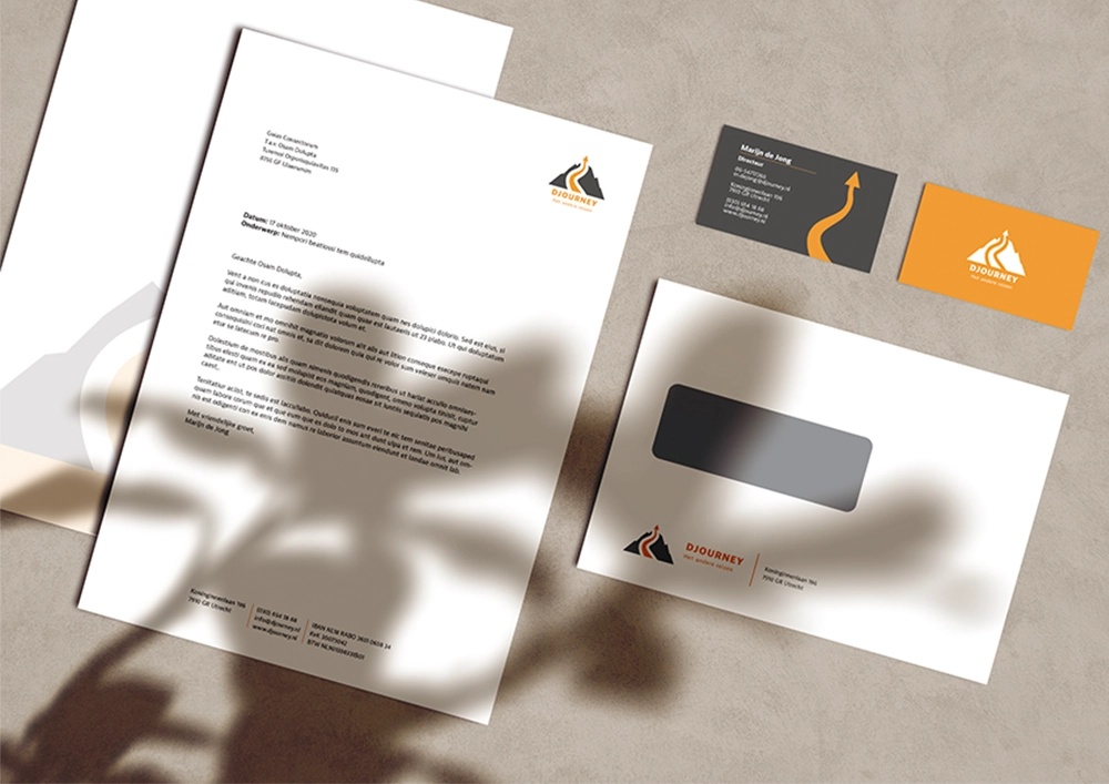
For the Djourney branding materials, I opted for a professional yet upbeat aesthetic, strategically incorporating touches of orange to infuse vibrancy. The letterhead exudes a sense of formality, complemented by the C5 window envelope, which balances practicality with a hint of cheerfulness. The business cards feature a sleek design, with the orange accents adding a pop of color to leave a lasting impression. Each element was meticulously crafted to reflect Djourney’s ethos of adventure and approachability. Through these designs, I aimed to create a cohesive visual identity that resonates with both professionalism and excitement.
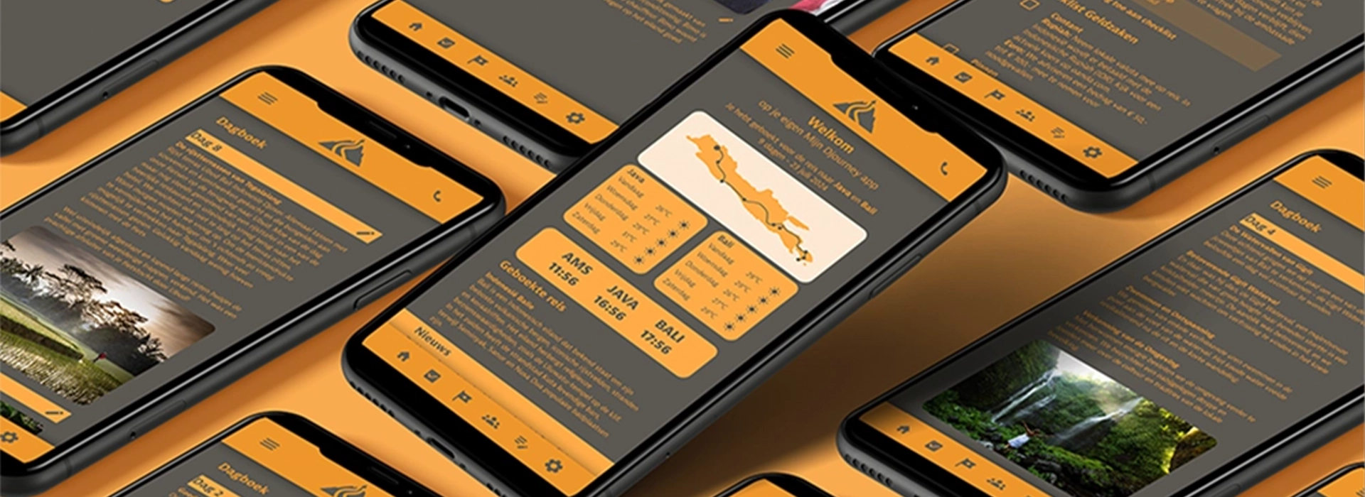
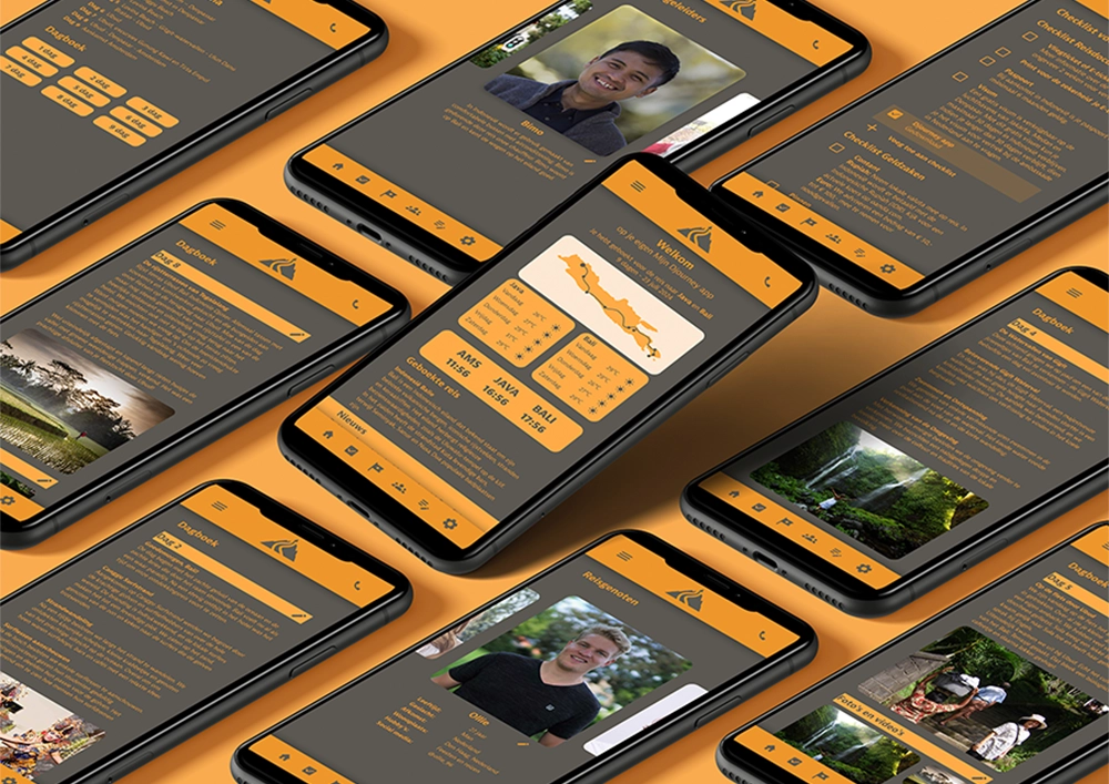
For the Djourney mobile app design, I revisited the brand’s signature colors to maintain visual consistency. My primary goal was to prioritize user-friendliness, ensuring seamless navigation for customers. The interface reflects the brand’s values of activity and connection, promoting an engaging user experience. By incorporating familiar design elements and intuitive features, I aimed to create a platform that embodies the essence of DJourney’s adventurous spirit. Through thoughtful design choices, I sought to empower users to explore and connect with ease.
In crafting the zigzag design for Djourney, I incorporated the brand’s distinctive colors to maintain visual coherence. My emphasis was on establishing clear text hierarchy to enhance readability and engagement. Leveraging the adventurous spirit of DJourney, I integrated numerous photos to evoke a sense of exploration and excitement. By strategically organizing content and imagery, I aimed to capture the essence of the brand’s core values. Through this dynamic design approach, I sought to create a visually captivating experience that resonates with DJourney’s audience.
Proces
Core Values
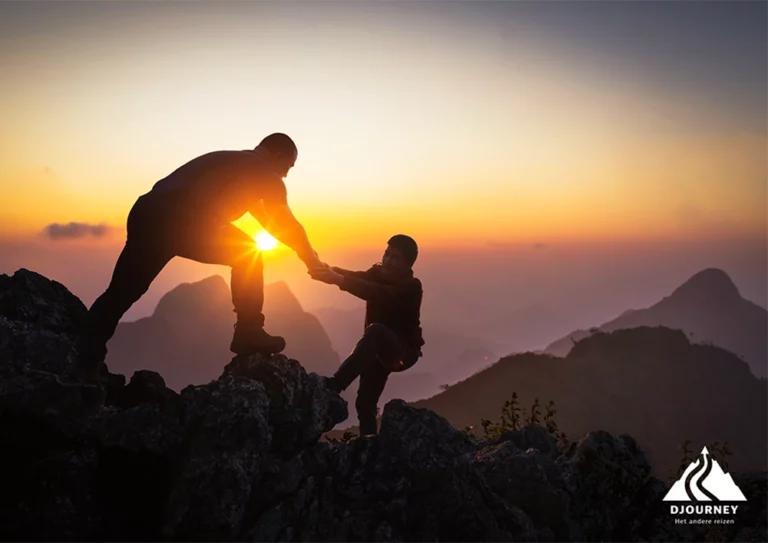
At Djourney, adventure is central. We offer extraordinary journeys infused with authenticity and surprise. Our trips are designed to take travelers out of their comfort zone and allow them to enjoy unexpected experiences. Whether you’re climbing a remote mountain peak or getting lost in the narrow streets of an old town, at Djourney we strive to make every moment of your journey an adventure.
Our trips at Djourney are steeped in activity and adventure. Whether you go on an expedition, climb mountain peaks, hike through the wilderness, cycle along scenic routes or paddle a kayak, we challenge you to actively participate in your journey. We believe that being active while traveling not only promotes physical health, but also stimulates the mind. At Djourney we are proud that we offer trips with a challenging character, where you can actively explore the world.
At Djourney it’s all about meetings. We strive to bring travelers into contact with new people, new smells, colors, cultures and customs. Our trips are an opportunity to not only explore breathtaking landscapes, but also to have meaningful encounters with fellow travelers and locals alike. We believe travel is about discovering the human connection that connects the world. At Djourney we encourage curiosity and cherish the wonderful moments of encounter that travel brings.

